Thank YOU! It's Customer Appreciation Week!
EXTRA 11% OFF Orders $100+ With Code: THANKYOU
EXTRA 11% OFF Orders $100+ With Code: THANKYOU

$0.89

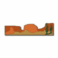
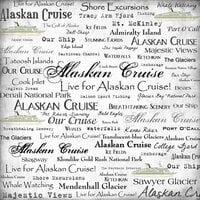
I knew the photo quality of this by zooming on the product photo. It's pretty pixilated which these days is a retro and a sign of laziness. You'll also note the pattern is actually not rock at all, its sort of a texture map from some computer gaming design program. I bought this paper for exactly these reasons. I like ugly, dirty, funky, and downright weird in my collage stash for certain things.
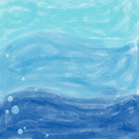
What I'm not happy about is the almost glossy coating on this other wise nice heavy card stock. Rock, earth, ground, sand... these are not glossy things! Disgusted, I whipped out my acrylic mat medium and smeared a test sample along one edge. It warped when I used the heat gun so I'll do the wax paper and a heavy book in the future. But it does work. A fine mist mat spray might work better.
I do wish designers and paper companies would put on their reading glasses when they go to make their final print orders. Some paper patterns need to be glossy like waves, rain and city lights. Some patterns must be low gloss or flat like rusted steampunk gears, lumps of gritty black coal, and misty pine forests. End rant.
You must be signed in to comment. Please click here to sign in.