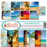
Mother's Day Weekend!
Take an extra 9% OFF with code: LOVE
Take an extra 9% OFF with code: LOVE


$9.00 $8.19

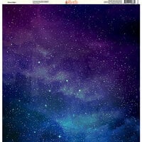
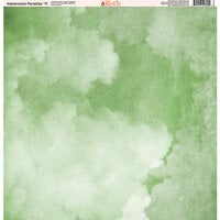
This is more atmospheric then the usual photographs which is a strength -- this way it can be used in different orientations and in smaller bits without loosing much of the readability. The color is the closest of this series to the stereotype sky blue but is not -- it's darker and tinge more purple which makes sense since other companies carry the expected color. I picked up #1, #7 & #9. These are three very different blues. I went for all three because there is not one color for sky with different kinds of day, light and year. It's also easier to match to other colors of papers, etc.
You must be signed in to comment. Please click here to sign in.