Happy National Scrapbook Day!
FREE Gifts + Extra 12% OFF Orders With Code: CELEBRATE
FREE Gifts + Extra 12% OFF Orders With Code: CELEBRATE


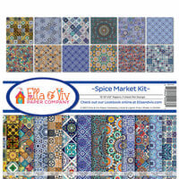
$9.00 $8.19


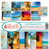
Neutral yet perfect background for the many beach activities we experienced on our vacation
Usually scrapbook paper is really thin but this scrapbook paper is the best quality I’ve ever used. The paper is so smooth, thick, and soft. It was shipped very carefully too without any bends in the paper. I’m happy with my purchase.
I’m using this paper for lettering on a beach page. I think it will work great for using on a blue water page.
I picked up four in this series of card stock and am not super happy with any of them. This one is a step-shade off of #6 which is most like white beach sand. It is more tan but orange "grains" of sand shift is oddly. The flecks of different minerals are tiny enough and add visual texture without seeming like non-organic dots. The not so good is the whole page is out of focus, much worse on the edges. This might work for desert sand dune pages with off-road layouts, of it you have orangish-sunburned beach photos. Viewing my needed and the price I'm not so pleased.
You must be signed in to comment. Please click here to sign in.