Mother's Day Weekend!
Take an extra 9% OFF with code: LOVE
Take an extra 9% OFF with code: LOVE

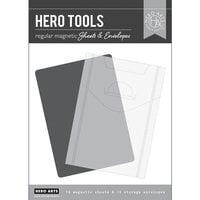
$26.99 $25.61
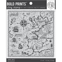
$24.99 $23.72
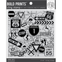
$17.99 $17.07
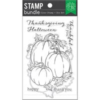
$24.99 $23.72
$14.99 $14.23


I did typesetting and design for ten years and continue to have a fondness for elegant letterforms even when they're not letters. One art director I worked with collected ampersands from different fonts and framed them on the wall of her office.
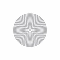
Anyway, I've been looking for plus or X shapes recently. Trust Hero Arts to produce one that has so much character. Those softly rounded ends? And the slightly tapered crossbars? Details that most will overlook, I know. But this one seriously elevates a slashing, ugly boxed end shape we see on the computer every day.
I will be doing tone-on-tone stamping with this image. With a little work, I can create a subtle brocade-type pattern. It can also go to more of a chaos fill when I want more energy without high contrast. On a large art journal or scrapbook page, it's possible to create an ombre sort of effect using density and slight variation in color -- heavy in one corner going to light in another. Since this stamp is a significantly sized shape, a tone-on-tone technique gets umph without being in your face.
I was also looking for an icon. For me, the four arms represent the four directions of the compass (my degree was in geography, not design) as well as earth/air/fire/water. I have also seen some lovely religious patterns and effects. Sometimes simple has a far greater impact them all those curly-cues and what-nots.
If you are a collector or have a set of large letter stamps, take a look at what you already have. Most sets do not have a plus character, but the X's might work for you. I happen to love this one, but will not be storing it with my alphabets. For me, this is a texture stamp with the bonus that it fits beautifully inside one of the circle stamps I already have.
You must be signed in to comment. Please click here to sign in.