FREE Standard Shipping on Orders $69+ with code:
FREESHIPPING


Aboslutely love this color combination! It works perfectly for my trip to Chincoteague Island, VA. I think it work well with any trip to the Outer Banks, Nc as well.
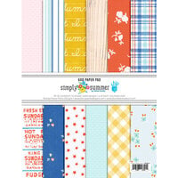
Sets can be a bit "matchy-matchy" for my tastes, but this set was nicely balanced. The pages were, as expected, color-coordinated, but the designs were different enough that I didn't feel I was using the same papers repetitively. And the colors were not *so* unusual that I couldn't add things from my stash as well, which helped to break-up the uniformity.
While some of the papers are specifically "nautical" in nature, they are designed so that the flip-sides are less so, making them more useful for general "water locations" than some papers of this style. Our trip was to various locations on Lake Michigan, which made good use of the colors, the wood grains, and the "lighter" nautical touches.
A well-thought out set!
You must be signed in to comment. Please click here to sign in.