Memorial Day Weekend Savings!
FREE Standard Shipping on Orders $85+ with code: FREESHIPPING
FREE Standard Shipping on Orders $85+ with code: FREESHIPPING


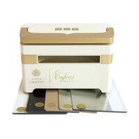
$270.00 $229.49
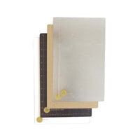
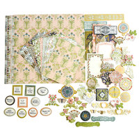
$180.00 $152.99
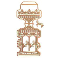
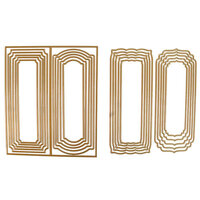
$59.99 $44.99
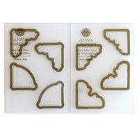
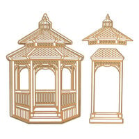
$53.99 $26.99
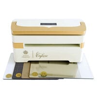
$37.99


I felt compelled to leave a review because I strongly disagree with the previous reviewer, who indicated that the product photo was misleading, that the colors were actually far less vivid and thus the paper was "more like a texture than a print because the colors are so dull."
I have a great many sheets of this particular pattern, and I think it is perfectly represented by scrapbook.com's product photo. The colors are highly saturated and the paper is just truly stunning! I'm wondering if perhaps the previous reviewer just got a bad batch? I can tell you that I did not purchase all of my papers at one time or even from a single source - mine are from multiple batches, produced at different times, so I truly believe that my review accuarately represents the cardstock. Hope this helps!

I thought the contrast was going to be more striking. Its not nearly as vivid in person. Its more like a texture than a print because the colors are so dull.
Used in this project: Christmas 2013
You must be signed in to comment. Please click here to sign in.